Components

A wealth of reusable components that play nicely together for simplifying the app building process.

navs

Tabs provide a clean way to separate distinct views.

Example

Raw denim you probably haven't heard of them jean shorts Austin. Nesciunt tofu stumptown aliqua, retro synth master cleanse. Mustache cliche tempor, williamsburg carles vegan helvetica. Reprehenderit butcher retro keffiyeh dreamcatcher synth. Cosby sweater eu banh mi, qui irure terry richardson ex squid. Aliquip placeat salvia cillum iphone. Seitan aliquip quis cardigan american apparel, butcher voluptate nisi qui.

Food truck fixie locavore, accusamus mcsweeney's marfa nulla single-origin coffee squid. Exercitation +1 labore velit, blog sartorial PBR leggings next level wes anderson artisan four loko farm-to-table craft beer twee. Qui photo booth letterpress, commodo enim craft beer mlkshk aliquip jean shorts ullamco ad vinyl cillum PBR. Homo nostrud organic, assumenda labore aesthetic magna delectus mollit.

Pills provide a distinct menu structure for navigation.

Indicate the current page's location within a navigational hierarchy.

Example

Provide pagination links for your site or app with the multi-page pagination component.

Example


Quick previous and next links for simple pagination implementations with light markup and styles.

Example

indicators

Provide contextual feedback messages for typical user actions with the handful of available and flexible alert messages.

Example

Warning!

Best check yo self, you're not looking too good. Nulla vitae elit libero, a pharetra augue. Praesent commodo cursus magna, vel scelerisque nisl consectetur et.

Oh snap! Change a few things up and try submitting again.
Well done! You successfully read this important alert message.
Heads up! This alert needs your attention, but it's not super important.

Provide highlighted tags on and within components..

Example
Default Primary Success Warning Danger Info
Example
Default Primary Success Warning Danger Info

Easily highlight new or unread items by adding a <span class="badge"> to links, navs, and more.

media badge

Example
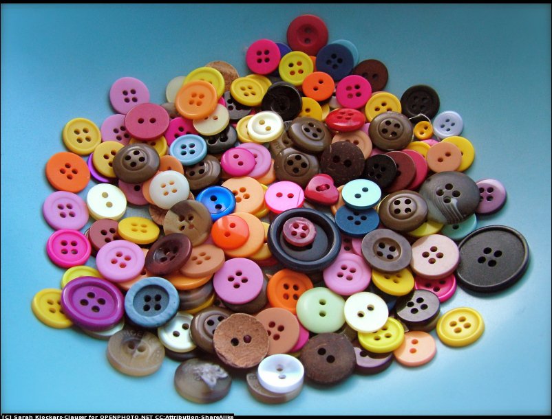
sample photo of sewing buttons

sample photo of sewing buttons
Example

Example

2

2

2

92%

100%

8%

Example

2

2

2

50%

100%

8%

8%

search input

The submit search input is useful when you want a user to click the search button to initiate the search action.

Example

The inline search input is useful when you want to provide search results in real time via an asynchronous search action. When text is entered into the search input, a cross appears within the component and clicking it will clear the entered text.

Example

list groups

The most basic list group is simply an unordered list with list items, and the proper classes. Apply the .active class to highlight a list item. Apply the .unselectable class to remove the item hover style.

Apply the .list-group-item-muted class to provide a distinct style useful for header rows.

Apply the .list-group-item-condensed class to reduce the top/bottom padding on the item, which is useful for providing a distinct row style when using with header rows.

Apply the .list-group-item-borderless class to remove the top border on a list-group-item, which is useful for stronger association of list items.

Example
  • Dapibus ac facilisis in
  • Active item. Cras justo odio
  • Dapibus ac facilisis in
  • Remove item border. Dapibus ac facilisis in
  • Without hover state. Dapibus ac facilisis in
  • Muted state. Dapibus ac facilisis in
  • Condensed list item. Dapibus ac facilisis in

Add the badges component to any list group item and it will automatically be positioned on the right.

Example
  • 14 Cras justo odio
  • 2 Dapibus ac facilisis in

Add nearly any HTML within, even for linked list groups like the one below.

Example
  • List group item heading

    Donec id elit non mi porta gravida at eget metus.

  • List group item heading

    Donec id elit non mi porta gravida at eget metus.

All list groups are minimally styled with no outer borders and only a thin top level border per item. This ensures the aesthetics of the list when placed within an app. However, there are occasions when a list group requires a top or bottom border to visually break up the components on the page.

Applying the .list-group-border-top class will set a border on the top of the list group.

Applying the .list-group-border-bottom class will set a border on the bottom of the list group.

Applying the .list-group-border-vertical class will set a border on the sides of the list group.

If you require to apply a complete border on top, bottom and sides, then rather than adding the three classes above, you can apply the .list-group-border-all class which has the same effect as applying the three above classes to the list-group element.
Example
  • Dapibus ac facilisis in
  • Duis velit libero
  • Mauris laoreet a libero
  • Vivamus eget egestas
Example
  • Dapibus ac facilisis in
  • Duis velit libero
  • Mauris laoreet a libero
  • Vivamus eget egestas
Example
  • Dapibus ac facilisis in
  • Duis velit libero
  • Mauris laoreet a libero
  • Vivamus eget egestas

inline form item

Example
Cancel A block of error text that breaks onto a new line and may extend beyond one line.
Example
  • Cancel
  • Cancel A block of error text that breaks onto a new line and may extend beyond one line.

media row

Example

Joe Bloggs

£103,234

Example

£103,234

Joe Bloggs

Example
sample photo of sewing buttons

Joe Bloggs

Developer

£103,234

Example

£103,234

Joe Bloggs

Developer
sample photo of sewing buttons

grid row

Example

Joe Bloggs

£103,234

£103,234

£103,234

£103,234

20

J Bloggs

£10,234

£23103,34

£103,234

£103,234

99

John Paul Smith

£80,30

£13,40

£103,234

£103,234

90

media group item

Example
  • Nulla euismod, sapien eu lacinia

    Donec eu ipsum vel massa pretium vene. In hac habitasse platea dictumst. Donec nec ligula pretium
  • sample photo of sewing buttons

    A media badge image left aligned

    Loose margin on header
    Tight margin on footer
  • sample photo of sewing buttons

    Joe Bloggs

    Developer

    £103,234

  • sample photo of sewing buttons

    Duis velit libero, condimentum eget

    Vivamus eget egestas nibh. Nam vitae tincidunt est. Aliquam erat volutpat. Aliquam et neque est; nam ligula.
  • sample photo of sewing buttons

    Mauris laoreet a libero quis cursus

    Pellentesque habitant morbi tristique senectus et netus et malesuada fames ac turpis egestas. Cras in ipsum justo. Sed ornare ipsum scelerisque sapien porttitor maximus. Aenean tempus sit amet arcu sit amet laoreet
  • Joe Bloggs

    Developer
    R&D

    £103,234

  • Joe Bloggs

    Mauris laoreet a libero quis cursus senectus et netus
Example
  • Nulla euismod, sapien eu lacinia

    Donec eu ipsum vel massa pretium vene. In hac habitasse platea dictumst. Donec nec ligula pretium

  • A small amount of content

    sample photo of sewing buttons
  • Joe Bloggs

    Developer
    R&D

    £103,234

    sample photo of sewing buttons
  • Duis velit libero, condimentum eget

    Vivamus eget egestas nibh. Nam vitae tincidunt est. Aliquam erat volutpat. Aliquam et neque est; nam ligula.

  • Mauris laoreet a libero quis cursus

    Pellentesque habitant morbi tristique senectus et netus et malesuada fames ac turpis egestas. Cras in ipsum justo. Sed ornare ipsum scelerisque sapien porttitor maximus. Aenean tempus sit amet arcu sit amet laoreet
    sample photo of sewing buttons
  • £103,234

    R&D

    Joe Bloggs

    Developer
  • Mauris laoreet a libero quis cursus senectus et netus

    Joe Bloggs

dropdown item

Example
Example

collapsible item

Example
      • Level 3
      • sample photo of sewing buttons

        Level 3

        Donec eu ipsum vel massa pretium.
Example

panels

By default, all the .panel does is apply some basic border and padding to contain some content.

Example
Basic panel example

Like other components, easily make a panel more meaningful to a particular context by adding any of the contextual state classes.

Example

Panel primary

Panel content

Panel success

Panel content

Panel warning

Panel content

Panel danger

Panel content

Panel info

Panel content

collapsible panel

Example
Panel content
Example

Panel Header

Panel content

notice

Example

Notice Default

You can customize the icon, title and text message to handle user messages inside your app.

Notice Primary

You can customize the icon, title and text message to handle user messages inside your app.

Notice Success

You can customize the icon, title and text message to handle user messages inside your app.

Notice Info

You can customize the icon, title and text message to handle user messages inside your app.

Notice Warning

You can customize the icon, title and text message to handle user messages inside your app.

Notice Danger

You can customize the icon, title and text message to handle user messages inside your app.

progress indicator

Example
Success title
£8,000

60%

Example
Success title
£8,000

60%

tile grid

Example

Gross Margin

£221,778

Revenue
£236,778
Cost
£14,804

Performance

92%

Target
£8,000

60%

Net Margin

£219,351

sample photo of sewing buttons
Direct Costs
£2,623
Indirect Costs
£12,716
Expenses
£1,313